Daily Painting Week 1

Day 1

I feel I should have been born with the middle name Procrastination. Once I get going I am usually OK, but the action of turning up feels neither natural nor pleasurable, which is confusing and saddening, because I have a small, but lovely studio overlooking my patio garden, with the luxury of a second, equally pleasing storage come working studio in the attic.

I don’t experience the same reluctance when I sit down to write, currently my first work, which I am 75,000 words into, or my blog, nor when I make my monthly trek to Anna’s ceramic studio, a two hour bone shaking bus ride, since I sold my car.

I have thought long and hard about why procrastination is my action of choice when it comes to painting and can only deduce that it is because, after over 30 years of reasonably prolific output, I still find it really difficult.

My procrastination frequently includes YouTube, under the guise of learning. It was during such a time waste that I came across a number of videos all extolling the virtue of daily painting, particularly after publically commiting to the challenge.

These official challenges typically last for 30, 100 or 365 days. 365 days seemed quite a commitment, particularly as my life is going through a transition period following lockdown, 30 days too few. I wanted the process to be personal, so I reflected on what had worked for me in the past and the achievement that resonated the most was the Couch to 5K running app, which I completed in the first few weeks of lockdown, aware that the solitary confinement would take its toll on my mental wellbeing. I run every other day in all weathers because I am well acquainted with the black clouds that bubble up on the horizon, when I don’t. The app was a nine week programme, 63 days, so that is what I committed to on Instagram, with the intention of it becoming a lifestyle choice if the benefits prove themself worthy of such a decision.

So, here I am day 1. What have I learned? Principally that my style of working, particularly in watercolour does not really lend itself to daily painting. Here we go, I hear you say! I totally get that, but here comes the excuse anyway. Other people talked about an hour to produce a painting. I wish! This is what I had accomplished after an hour.

Watercolour working from my source photo.
Charcoal working from the same source.
Preparing another base with tissue paper ready for a freer approach

Watercolour and paste require drying time, so unless I start work on my paintings first thing and return later in the day, not my normal way of working, but I am here to learn, I need to prepare for the following day, whilst the drying takes place.

The other nagging thought I had was that I really should be working from life with these smaller works. I would normally work from a photo, for two reasons. It may take me weeks or months to complete a painting, during which time the flora usually is a distant memory. The source material is but a passing phase once the painting gathers momentum and gains a life of its own.

My final thought is how does anyone produce a painting in an hour!

Day 2

i must have been standing awkwardly to work yesterday because by late evening my lower back was displaying the familiar sign of a pending problem. I awoke this morning barely able to walk.

I managed to shuffle through my day, applying a second layer to the watercolours, which was barely perceptible to the naked eye.

My amazing friend dropped by to give me a Feldenkrais treatment, which has worked spectacularly well in the past. A new day tomorrow.

Day 3

As the layers start to build and that feeling of memories, history, begins to emerge, I am feeling like the old me. That stark initial watercolour makes me feel exposed, like someone who doesn’t know what they are doing.

Again the image is starting to develop character and i am much more comfortable with that.

Day 4

More layers, creating more depth, starting to add defined dark areas.

Adding more definition.

Day 6

Today I wanted to attempt some looser, non layered paintings. I have been playing with colour combinations. this is W&N Opera and Cerulean and Daniel Smith Hansa Yellow. The painting is of a Cyclamen. i will revisit tomorrow.

These are two other works that I managed to finish this week, spurred on by daily painting.

Watercolour on paper, 56 x 56 cms


Watercolour on paper, 38 x 38 cms

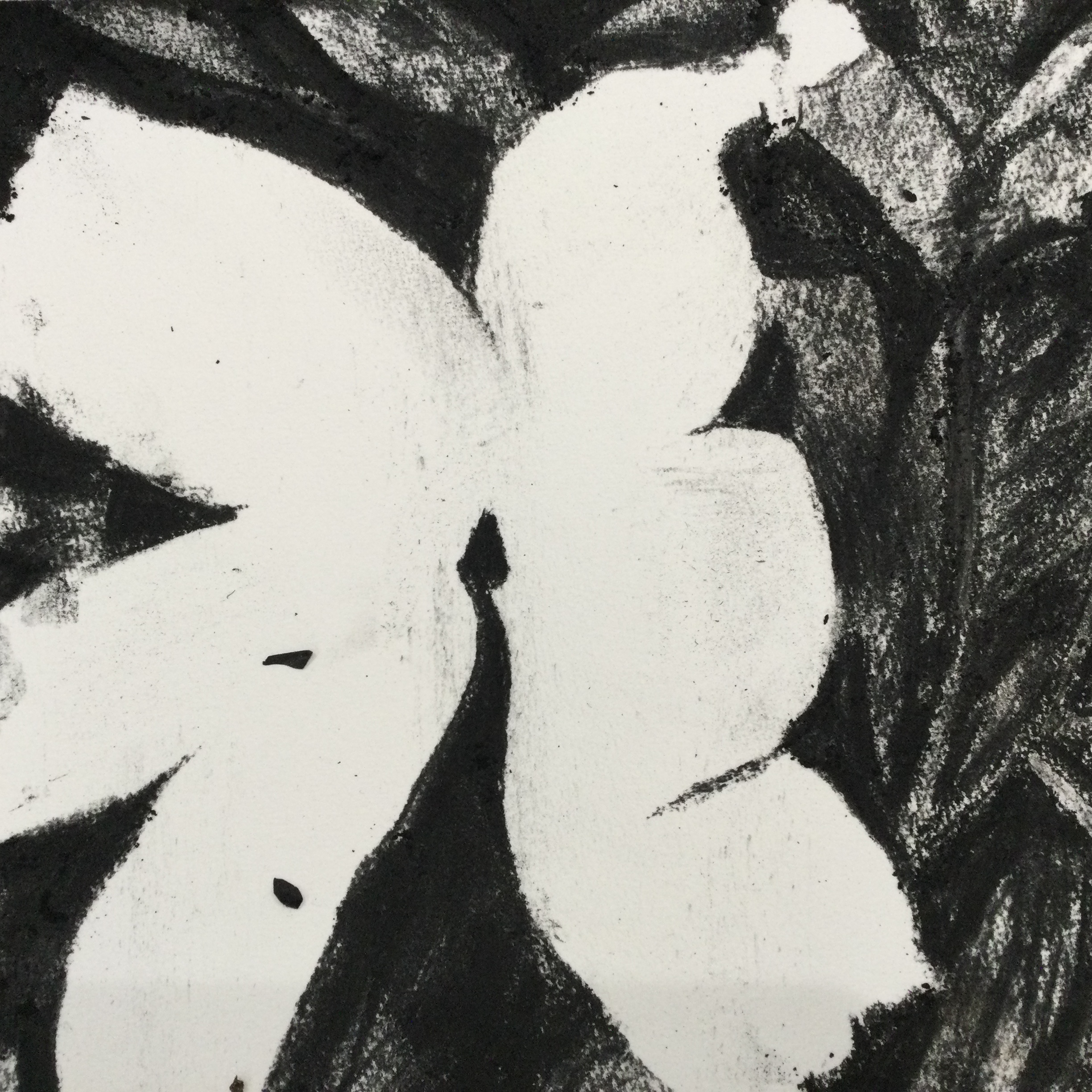
Why lilies? My work is very personal, I paint my emotions, my experiences, what matters to me. I use floral motifs as a way of accessing particular emotions. Recently I have used snowdrops in my Tread Softly series to represent hope, roses in my Say It With Flowers series to represent love. I return again and again to lilies to signify death, personal or more general, or an ending, the end of a relationship, an experience, a chapter of life.

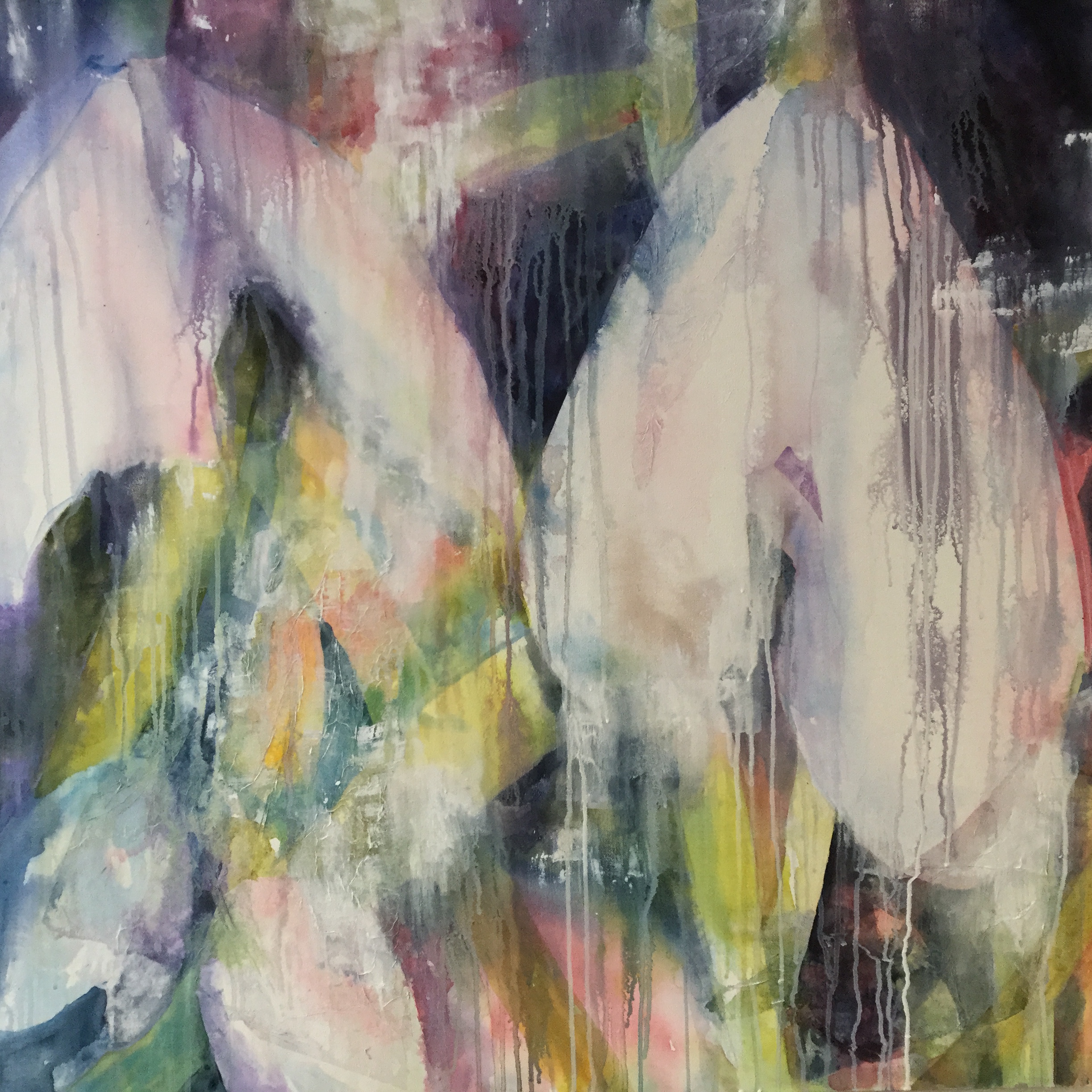
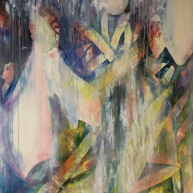
Painting intuitively allows me to express my feelings in a creative way. This was another work that i finally resolved this week thanks to daily painting.

Madame Butterfly, watercolour on paper, 38 x 38 cms

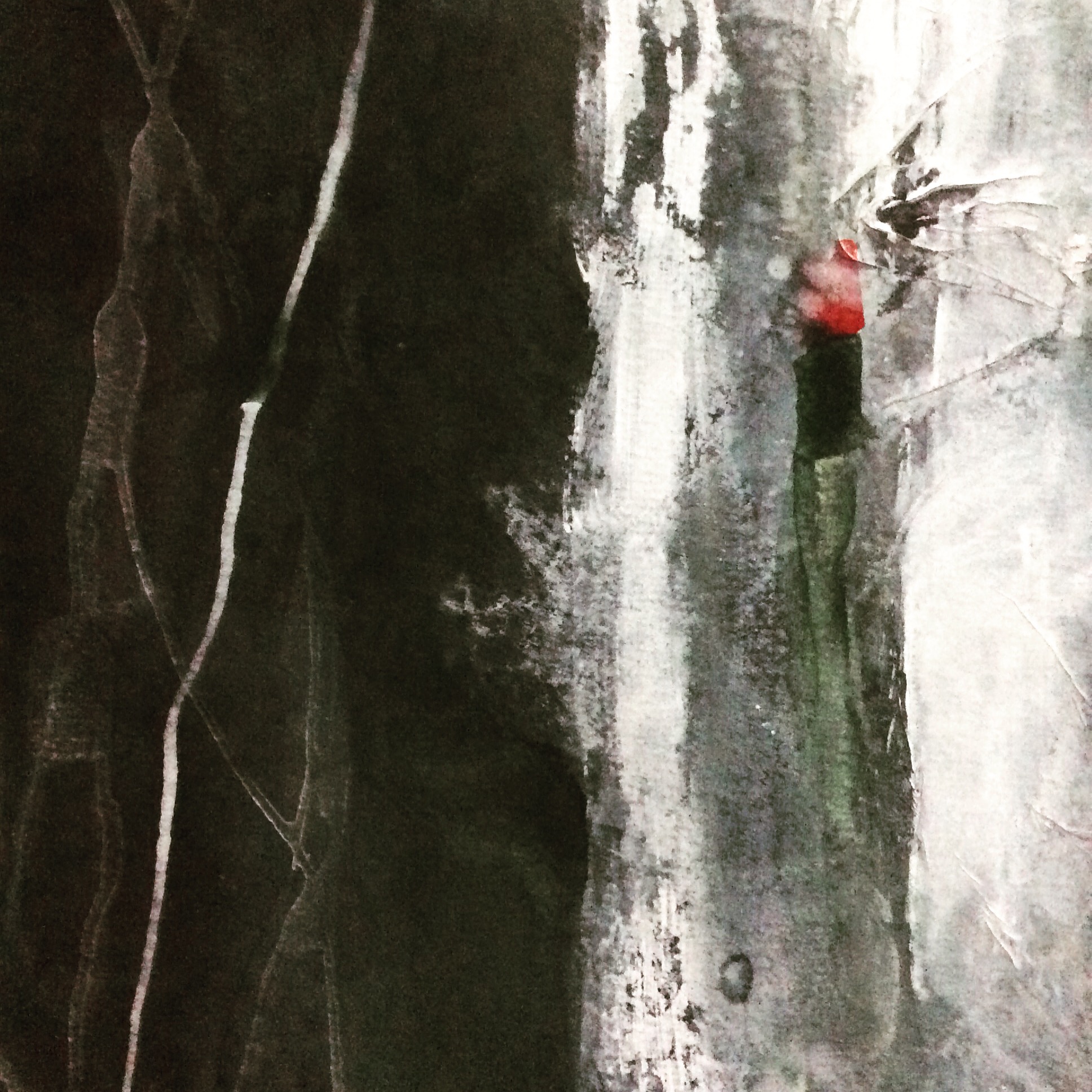
I didn’t set out to paint this image, but she appeared first, followed by her suitor. Someone on LinkedIn kindly commented that it is ’Hauntingly beautiful’. That is probably the most emotional comment I have ever received, and exactly the sort of reaction I am trying to achieve with all my work.

Day 7

Trying to simplify with fewer layers

These images feel like when I was painting in the 80s. Too literal. Need to find a way of making more expressive marks

Moving On

We are nearly three weeks into lockdown with Covid-19 virus.  Strange times that play with your head.

I have spent that time producing the final two works for the Tread Softly series, a timely comment on the world as it suddenly finds itself.  The Tread Softly series is inspired by the W B Yeats poem, Cloths of Heaven, an ode to hopes and dreams.

FFD2D741-8760-4130-BCFC-0221B7BD896F0E92AE14-95DC-4DA0-B472-1F49085CC01ABoth of these paintings are still works in progress, but are almost there.  They are at the stage where I need to work for a few minutes to make a mark, and then wait til they dry, before making a further mark, a process that could take days or weeks.

In the meantime I have been thinking about what I do next.  All I know is that my current work seems to be responding to poems, Warnings, by Scottish poet Jenny Josephs, Yeats’ poem, and now what?

My next series will be very much about where I and the world are now.  I awoke this morning thinking that it may be Norman MacCraig’s work, Summer Farm, an exploration of the selves, but that didn’t feel right.  Then Shakespeare’s Sonnet 14, then Ovid, then Sonnet 75 and a whole host of poems in between.  But the work I have come back to is East Coker by T S Eliot, part of his Four Quartets, a book I first encountered during my MA whilst researching Roy Oxlade, which led me to Philip Guston and his work East Coker.  I think I might be here for a while.


Commission

I don’t undertake commissions, I can do without the stress.  What I see and what the viewer/buyer sees are not necessarily the same.  But this was different.  This was for two very special people, who have been so supportive of my work over the years, that I thought this could be a very interesting challenge.

They had very fixed ideas about palette, not my usual needless to say, so that would be a development for me.  They wrote me a brief (he is a designer after all), abstract, textured and huge, 150 x 100 cms, on paper not canvas, accepting that they would need to hire a van to transport, what would be a very fragile glazed work.

Having bypassed a BA, I have not developed the habit of using a sketch book.  I wish I had, it would have been so much more convenient, but I tend to explore ideas as works in progress, where some work easily, some take more effort with the rare exception ending up either downsized, or in the bin.  I decided that it would be opportune to use this experience to build a series of paintings 76 x 56 cms, each exploring a different aspect of the brief.  I decided on a random 10, which I would then discuss with the clients to determine the elements from each that they would like incorporated into the final work.  Due to the way I work and the unpredictable characteristics of watercolour, I would aim to produce two final pieces, from which the clients could choose.  The other would be available for my Pushing Boundaries exhibition at Hastings Arts Forum in July 2020.

3D09C552-5DFB-4EA2-9554-F7AA79A4F0F0


The green and darks palette.


Early explorations of acceptable palette, structure and possible textures.

IMG_3281

The first introduction of magenta.


The image on the left is considered by the client to be the sort of structure they are looking for.  The image on the right a palette closer to their requirements.

IMG_3756

The expanded palette.


The first layers on both final works.  Note the initial works propped around the studio as reminders of the elements that worked.

1FF87C91-4310-4EFC-830F-0D8D0DBF71C0

Close up of sip of painting finally selected.

3BBDF3A5-51C5-408F-8381-F68497BEFA47

Second painting wip.

IMG_3412

Close up of painting 2, probably half way through.

IMG_3434

Painting 2.

At this stage the works reflected the brief and were shown to the clients.  Areas were identified as pleasing, but it was felt the works didn’t reflect what they liked about my work.  It was agreed that I could ignore the brief to develop the works in a way that felt less constrained.

IMG_3433

I introduced more subtle variations of colour, added white to create more contrast, added ‘pops’ of interest, continuing to layer until the resultant works felt right.

8FBDFDBA-2847-4897-BEE7-C4C66EA27F1A

A particular favourite area of painting 1 that I will produce as a giclee print.

Views of the clients’ final painting.

image-3.jpeg

The final image 150×100 cms.

A five month marathon and a real test of my determination and self belief.  There are 30-40 layers of paint, each layer very wet, taking days to dry, during which time the work could not be moved.  Each layer may have taken a few minutes/a few brush strokes, or may have taken much longer with an intense interrogation of the image.  I work by responding to the image, adding, deleting, making connections, responding intuitively to the resultant work.  This commission tested me and my process to the limit.

I had no vision for the work, just an intention.  Once the constraints of the brief were loosened, I felt more confident, more ‘at home’ with the process and direction the work was taking.  The addition of specific details, a magenta line, a lime soft pastel mark, a white trail, created the visual cohesion I had been seeking and a work that I am proud to have produced.

The new owners live by the sea.  This work references this fact without being a seascape, exactly what they wanted, without the sea being mentioned.  Intuition at its most powerful.

The work has been sealed with three layers of Spectrafix fixative, a casein based product from a recipe used by Degas.  The work will be tray framed and unglazed.

Would I undertake a commission again?  It would take a lot to convince me!

During the time that I was working on the commission I was also undertaking a residency at the Pugin chapel in St Leonards.  The colours of the chapel,  by coincidence, (or design?) are those of the commission.  The works below were the exploratory works for the commission which were further developed to reflect the atmosphere, the artifacts and the occupants of the chapel.

From the left Releasing the Feminine l,  Father, Son,  Releasing the Feminine ll.


Ghosts l, ll and lll.


Residency – Looking for Icons

Whilst holidaying in Greece I wanted to see some Greek icons.  The Orthodox Church and Greece had played an important role in John Tavener’s life and I was curious.

My host had discovered a tiny Chapel in the middle of nowhere whilst out running.

We abandoned the car on some wasteland and walked uphill for the final few minutes to get there.

6CB635A0-D71F-4E6E-B9EB-E8A29F3B3BD3

The door was being lovingly repaired as we approached.  The humble exterior did not prepare me.

The interior is extraordinary.  A joyous celebration of the Orthodox faith, far removed from the pain and suffering so beloved of the Pugin chapel.

77C353C1-79EC-4349-A4AF-63A08EE766BC

C2867C34-7EB2-482B-A28E-F6BF95B524C188AA1D97-A8A8-48C9-BEE0-47049AFFE65A

Walls, ceiling, every possible surface decorated (and in surprisingly good order), with saints and symbolic images.


The passion and love that had created this jewel of a building was palpable.


460D1CA1-52B4-478A-BEE9-647C50B10977

I clearly had a misconception about icons, in particular the preciousness, which was brought home to me at another Chapel in Milies, where there were row upon row for sale in the entrance at 5 euro a time.

The icons may not have lived up to expectation but the Chapel was an unexpected delight.

Residency – A Different Perspective

Whilst on my last visit an artist friend came to view the Chapel.  She kindly offered these observations:

Nothing could have quite prepared me for the experience of stepping into the chapel…  even though Susan’s drawings, photos and descriptions are truly evocative, the overall impression was quite overwhelming for me.  A heady mixture of profound decay; an absurd theatrical setting (a large table and velvet chairs in front of the altar); a jiving Jesus above the altar and a pieta underneath it …  and debris, humid salt air that catches your throat everywhere.  Suffering and somewhat feeble attempts at the sublime.  Susan’s matter of fact comments on the ‘tacky’ plaster sculptures shook me out of my ‘lapsed catholic’ trance.  Decay, suffering and beauty in unexpected places.

I am reminded how there is always more than one perspective.

I write this from my balcony in Greece, looking out to an unusually leaden sea and sky.  I have brought my mineral paints to further explore the materials.  I am enjoying the process.  It is only by playing that you get to appreciate the possibilities and limitations.

8B5E9CDE-7097-4DD0-B4E8-D2AF7A491F51

The grainy Bloodstone floats on the surface disturbed by the slightest attention.

D33F5549-D04B-4544-B573-E4EE8C3B1084
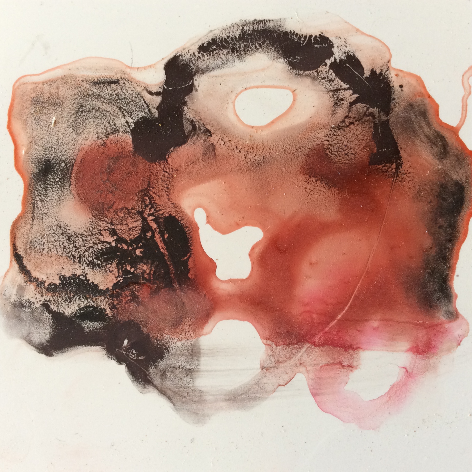
The Rhodonite finds it hard to compete with the Bloodstone.

I try painting a figurative subject, my view.  The exercise is about revisiting the dried paint.  Yupo paper feels like plastic.  If you don’t like what you have done, wash it off and start again.  Therein lies the major problem for someone who works with many layers to build the work.

C63B8ABB-ACFF-4216-B8AF-0A6B37BFB19F

Watercolour on Yupo, 14 x 14cms

Dropping clean water on top of the dried work the boundaries slide, so exact working seems almost impossible in my novice hands.  Any contact with the dried work by wet brush moves or removes the dried paint.

17FF06D7-4932-40C6-BC5E-5B3402E7E38B

Detail from the view.  The white areas were easily created by removal, almost impossible without preplanning on watercolour paper.  The green lines are naturally created from dried pools of Green Apatite mineral paint, carefully pipetted over the dried work.

Green Apatite is very much the colour of the Chapel for me, together with a deep rich red, which will need to be mixed from a combination of Red Fuchsite, Rhodonite and Garnet.

3B412CEB-B7CA-49D9-A2D5-4C6267D1B194.jpeg

I am drawn to the decaying quality of the green.


Residency

The icon is challenging, no, paralysing me.  I have tried three different Japanese washi papers, Kizuki Kosovo, Yuki Gampi and Tosa Shi (strong, lightweight papers made from mulberry or bamboo), that should have worked but don’t.

341A3A76-96AC-4959-91F3-1AD756F5654F.jpeg

I am now awaiting delivery of a yupo paper to continue experimenting.

I am also experimenting with hot pressed  (smooth) Saunders and Fabriano 250lb high white papers, which are proving more successful.  That said, I am still not happy with the images I am producing and am struggling to stay motivated.  I have decided that I need some separation.

B71CF352-E2BD-490F-A71E-25BAB5A5B517

So to ease the pressure I am simply playing with the paints creating small abstracts.

7B023496-D5F1-48D0-86BC-47F08D73DE95

51BF8C38-E7D7-4AD9-9EFF-0331D3E0AA9D

CB9C18A0-D8A0-4C05-8DAF-38950B136B43.jpeg

In between watching the paint dry and revisiting old works that I am not completely happy with, I have been producing a large charcoal work of the damaged Jesus, over two metres long onn Fabriano paper.

7F4E425D-6B96-4761-8FF8-4CAEF172BC49

D2180125-4949-4E82-A721-FAD48CCD1D8AThe logistics have been interesting in my temporary studio, where I do not have a suitable wall.  I will need to complete the left hand side of the work before moving the paper, as currently the right hand side is over the light switch.  Oh for a more suitable studio.

Residency Finding My Way

This week I wanted to spend some time exploring my new paints.  I have been reading about the Stations of the Cross with a view to producing a series of ‘icons’ based loosely on the structure of each image.  To be clear, I am using the Stations as a vehicle, an access point for the viewer, and not for their religious symbolism.  I am also referencing the Stations as a connection to the physical building because they are relief works embedded in the walls of the Chapel.

Interestingly permission for the Franciscans to erect the Stations inside their churches was only given by Pope Innocent XI in 1686.  In 1731 Pope Clement XIi extended this permission to all churches provided they were erected by a Franciscan  Father, with the consent of the local bishop and the number was fixed at 14.  In 1857 the necessity for a Franciscan Father to erect the Stations was removed for bishops of English churches and in 1862 this was extended to all bishops.  The Pugin Chapel was consecrated in 1868.

The icon, (the Greek word for ‘image’ or ‘resemblance’), is my connection to Sir John Tavener, my inspiration for this project, who was a member of the Greek Orthodox Church.  An icon is a religious image, usually a painting, found within the cultures of the Eastern Orthodox Church.

This is the sort of image I have in mind when I think of an icon.  Gold leaf, figurative, and jewel-like, small and precious (although  this image is much larger than I expected).

94E8A7F2-6802-43FF-A53B-2D742A319D83

Theotokos or Our Lady of Vladimir taken from Wikipedia. Around 1130 Constantinople.  Tempera on board. 104 x 69 cms.

The colours used in an icon are symbolic.  Gold, the radiance of heaven, red, divine life, blue, human life, violet the sovereignty of Christ, green is growth.  Most include calligraphic text.

I have always felt that icons were ‘special’, and not necessarily for their religious connection.  I wanted my icons to be ‘special’ too.  In my research (Victoria Finlay has written an excellent book on the sources of colour, Colour: Travels Through the Paintbox), I discovered a range of paints by the American Watercolour manufacturer Daniel Smith that are made from minerals.  I selected 11 for their differing qualities, texture, sparkle and colour, to which I also added gold leaf, a material new to me.

E0A9BD9A-08DF-4674-982A-FD38581FA71F

2B2AC9D5-3FC9-4F22-960B-2E7106934B10

I selected Red Fuchsite, Garnet, Mayan, Bloodstone and Green Apatite and started working on various versions of Station 1, with and without tissues surface.

E8095FD7-2DBC-41C1-A3F0-817D6E26A519

This is not the feeling that I am seeking.  I feel I am adhering too closely to the colours of the image in the Chapel.

1E4C05F0-0778-4D71-BECC-B2B8AA7786BB
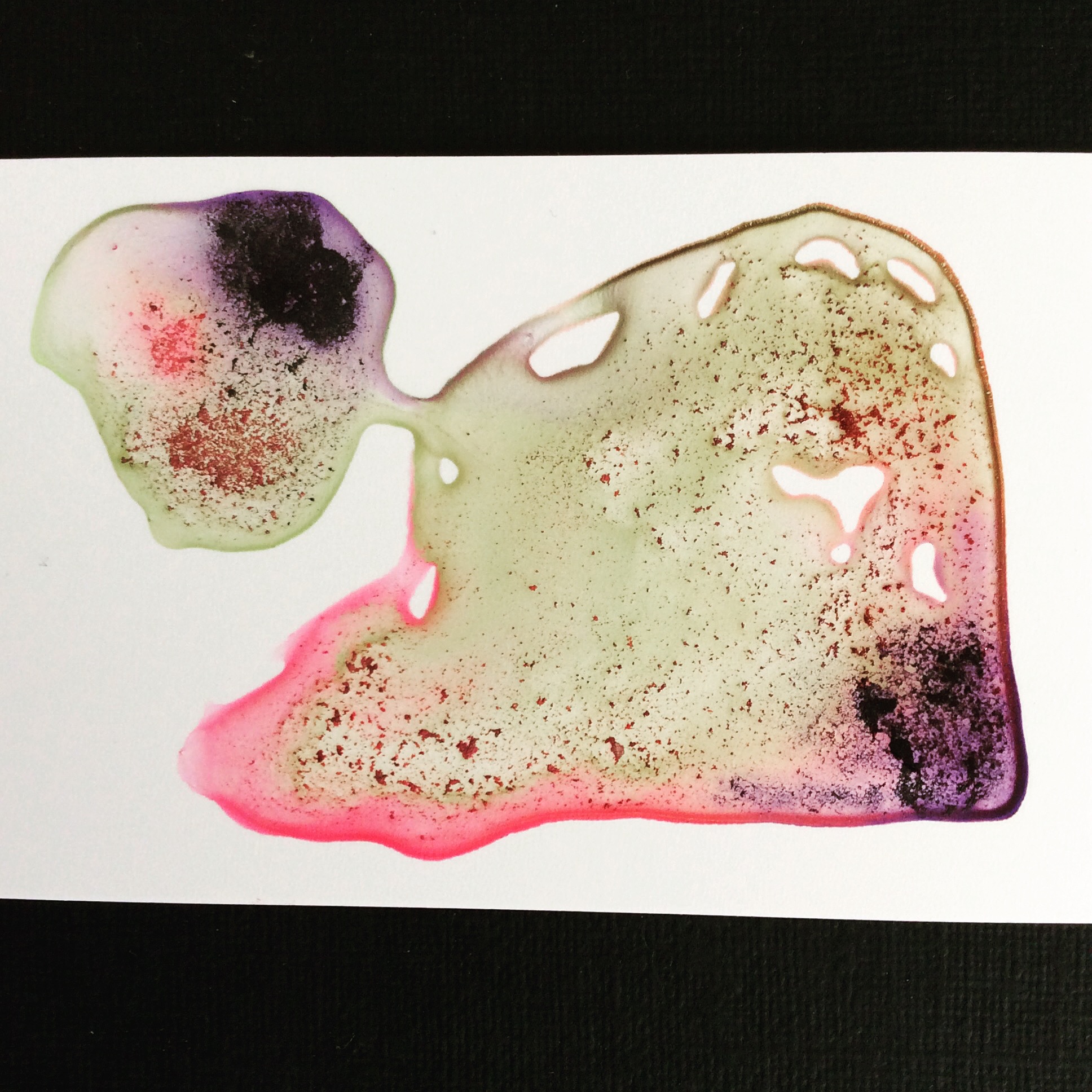
I need to rethink.  Maybe change the paper, my approach, the intensity of the colours.  I feel that these beautiful paints need to be allowed to speak more for themselves.  That said, I will continue to develop the unsatisfactory images just in case.

Residency Day 18

Sensations

The Chapel is completely silent, heavily silent, in a way that is rare in a town.  My skin feels that slight itchiness after only a minute.  The salty air?  Or the deadness that permeates a building with no opening windows?

A mower starts up nearby and masks the life that exists outside the Chapel, someone hammering, birdsong, the distant sound of traffic.  Someone enters, crosses  herself and observes.  After a minute she is gone.  I busy myself, the sensations melt.

Back alone the mowing has stopped.  The air has an iciness.  Prepared, I am wearing three layers when a T-shirt would suffice outside.  I am willing the building to converse, but all that seems to have happened is my face, arms and legs are getting colder and my back is aching.  Pews designed for suffering!

I have come specifically to work at the north west altar. 4E362EFE-B838-4710-BDE4-27BAB033D227No special reason why this altar other than the words are easily accessible.  I want to combine the traced words with an ink painted image on top.  I choose the angels.  Why not!  This is when I realise the problems of working on site.

I trace more words with charcoal and hands, and charcoal an image of an angel. 57D397F1-4AC4-4199-A421-87FA639F833FInterestingly the words traced by hand with charcoal dust (at the bottom), look more manufactured than those without direct human contact.

178813CD-B0BA-4B73-8DEB-1E35B71F88D0
My hands look like a miner’s.  Everything I touch I leave my mark.  There is nowhere to wash them.  I plough on.  I struggle to open a large bottle of ink.  I am new to ink but it seemed a suitable medium to dry quickly and be transportable.  It appears I can only pour into a smaller container, which I haven’t brought.  There is no direct access for a brush. Ho hum!

I glue the words onto paper.  Nowhere to clean the brush, no bag to transport.

I draw over the glued tissue, which moves, disobligingly under the charcoal, which I hadn’t intended to use.  Lesson learnt.  Next time..

A5AB64BC-987D-4776-99DF-AAD543CCA3F3
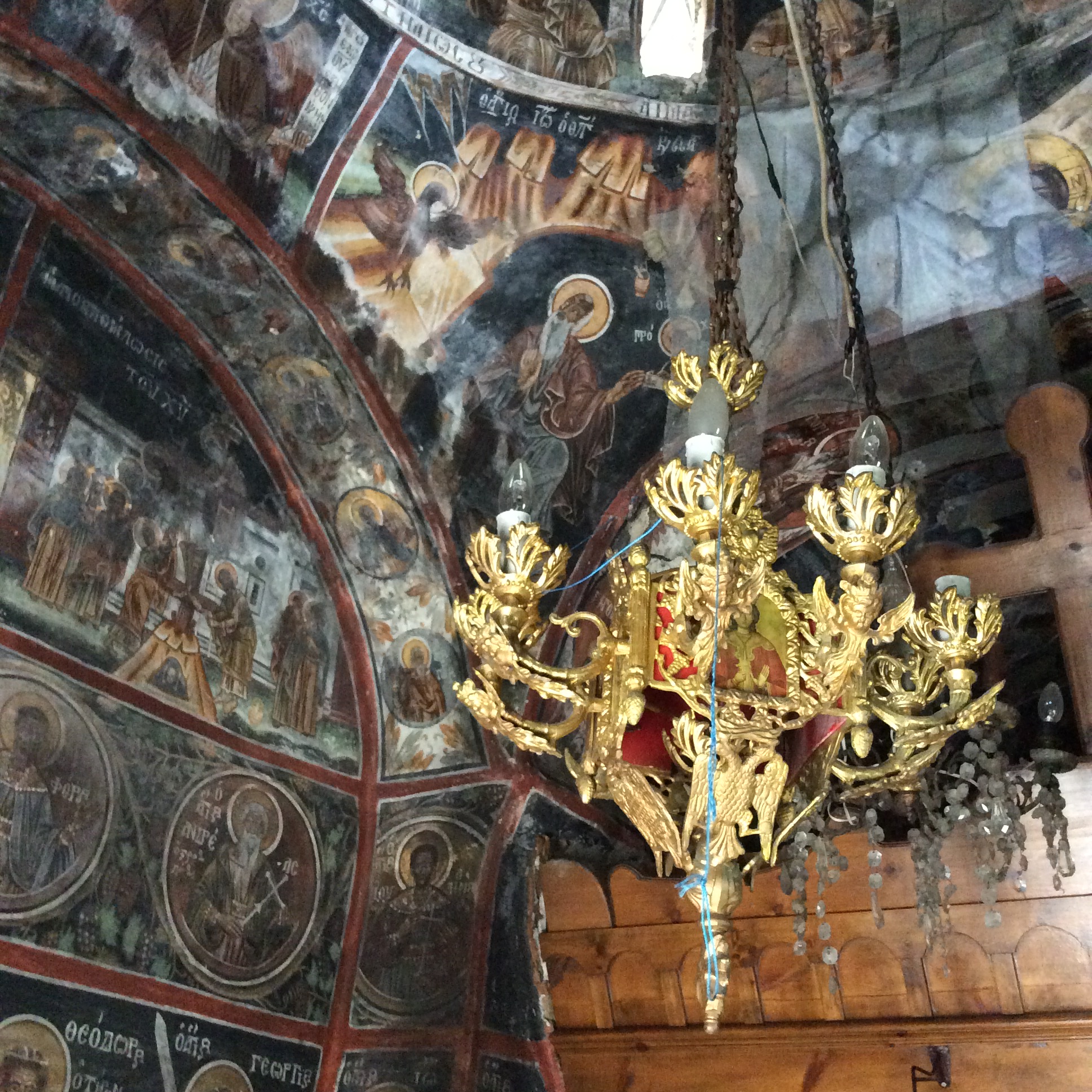
I return to the pew to give my knees a rest.  Looking at the main altar I am reminded that once you see something it is difficult to unsee.  I see two ghosts with their arms raised, to the left, above the figures, and two girls to the right with long bunches, similar to the characters in a manga comic.  I sit there wondering why the Catholics would make such a homage….   clearly time to stop.

F1E85747-147E-4BA9-AE44-8288796B5E65

Residency Day 17

Following a course I recently took to release ‘stuckness’ in painting, I have been working into collaged torn paintings.  This together with a comment from a reader to perhaps consider incorporating some of my writings with the work, has curiously led me to take some tissue rubbings from the Chapel.

239D86A1-E8BC-4CD9-8B01-FE04E2FF5BD6

214BD9BF-4840-45B5-B5F0-92CA5ED30F4B
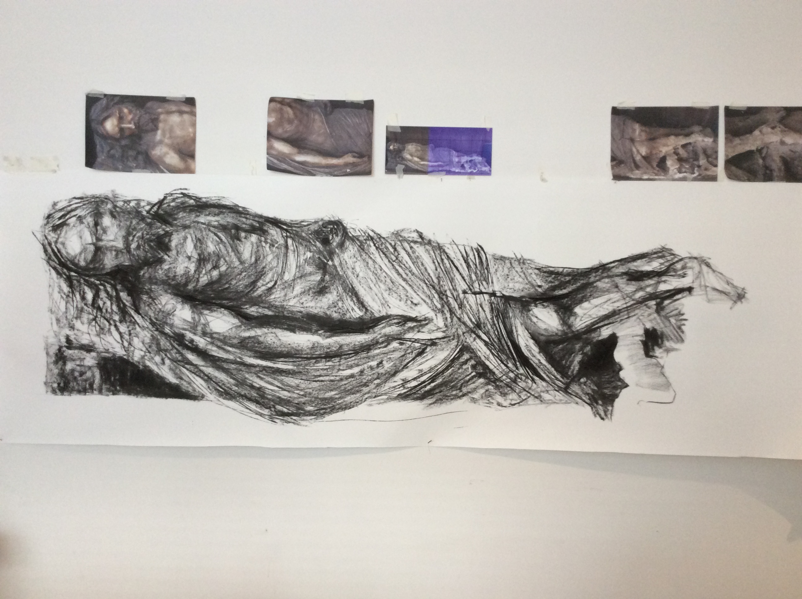
I work with tissue for its textural and unpredictable qualities, so this could be a natural extension to that practice.

Two of the altars where I took the rubbings from.  The one with the red fabric is supposed to contain the remains of a dead child, so being a couple of inches away from the glass was quite disconcerting.  In fact this was the final rubbing after which I had to sit in the sunshine to relieve a very uncomfortable feeling, not quite nausea but certainly something wasn’t right.

By this time the sun had moved and was flooding through the westerly stained glass windows.  I decided to use the opportunity to revisit the right hand window, accessed by a spiral staircase.  The resultant images are joyous, in a way that I do not experience elsewhere in the building.

Again I am not sure what I will do with the images, maybe use as the basis for painting, maybe just keep as photos.


Residency Ghosts

This week I wanted time at home to process what I am experiencing at the Chapel.  Due to the impracticality of transporting flat soggy large scale watercolours in a mini, I find I cannot paint in the Chapel.  It has been suggested that I leave the work to dry in situ, but with filming and other events taking place in the building, not to mention the inevitable paw prints of Target, the estate dog, that too is not an option.  So home it is.

A couple of weeks ago I sat silently in the Chapel for half an hour, listening to and absorbing the building, its history, its occupants, the conversations witnessed.  Other than meditating, the conscious mind was not aware of anything.  No ghosts, nothing.  Many years ago in Chicago, I encountered what I believe was a ghost.  I had no such feeling here.

Working with the unconscious requires a certain amount of faith in the process.  As the hotel owner in the Marigold Hotel said ‘It will be alright in the.  If it isn’t alright then it isn’t the end.’

My process requires many layers of paint, applied over many days or weeks.  I have no specific image in mind but respond intuitively to the mark making in front of me, allowing the unconscious to influence direction.  I work on 5 or 6 paintings at a time, each at various stages of development.  In this way I am neither precious nor bored, just curious, and often disappointed.  I rarely abandon, reworking until the work speaks to me or is repurposed.

During such a session this week this image appeared.

E6F0418A-5EA8-45BD-993F-90F9C0869E57

This is still a work in progress but I have titled it Conversations with Ghosts.  They were present in the Chapel all the time, I just couldn’t see them consciously!