Paul Klee Painting Music

Following on from Klee’s On Modern Art, I spotted a book about Klee and painting music by German art historian and lecturer, Hajo Duchting.

I must admit to being disappointed that the book was about Klee applying the motifs and rhythms of his musical knowledge, as a professional musician, rather than being inspired by and responding to a particular piece of music.  That said, Duchting ably charts Klee’s exploration of the subject, together with his specific use of colour to support the rhythms in his work.

What I found particularly useful was the charting of the development of his ideas, supported by examples of Klee’s work.  His representation of movement in time in watercolour, in Fugue in Red, 1921;

developing the relationship between tonality and colour during his years at the Bauhaus; his ‘polyphonic painting’, where Duchting notes ‘the layering of various structured areas produces…..a harmony of forms, in which colour takes on a specific meaning.’ p65; through to one of his most accomplished works, Ad Parnassum, 1932, 100 x 126 cms, where the juxtaposition of orange and blue creates an iridescent flicker.

Reflecting on Klee’s work

As I battle to get my work to ‘sing’, I realise I have a lot to learn with regard to the placement, application and layering of colour.


Where Now?

This evening we are critiquing half the cohort’s work, an interesting challenge, particularly as we are all different disciplines.

The exercise in selecting work to be critiqued has forced me to reflect on where I am with my work.  My confidence as a painter is a casualty.  I still feel I am in no-mans land, with no clear direction.  I find myself meandering through the research, but having the attention span of a butterfly, (the history and application within art I researched, thinking this may be my unconscious mind pointing me to a subject matter, fascinating, may explore further).  All of which is a great and justifiable reason for not actually focusing on my painting, but I suspect is a delaying tactic for what is proving to be like grappling with a phantom.

The fact that this is proving so challenging, could, if this is resistance, be meaning that I am rowing ‘upstream’ and need to raise the oars, and let go, allowing due process to run it’s course.

At the moment I have 20+ works on the go and 20+ different directions, flitting back and forth in a state of near panic.  The nature of working with watercolour doesn’t help, requiring either multiple pieces due to drying time, artificial drying together with the implications for the work, or lengthy pauses between activity.

IMG_0781

Former style, detailed, expressionist, floral, 38 x 38cms on paper

IMG_0783

A current theme of doors, windows and spaces, 18 x 18 cms on paper

IMG_0782

Behind Closed Doors, 38 x 38cms, on paper

IMG_0787

Torn watercolour paper on canvas, 50 x 50cms

075

Torn watercolour paper on canvas, 50 x 50cms

IMG_0792

30 x 30 cms on Khadi paper

Experimental watercolour on charcoal and chalk, all 56 x 56cms on paper. Yellow is the colour of identity.  I have been researching colour history and the work of Korean artist, Hyunmee Lee. Her bold use of colour blocks and fine lines reflects the thoughts of Roy Oxlade, whose approach to subject I am keen to explore, but don’t yet fully understand.

If the legs on the child in the first image had been less defined, I would have been happiest with the immediacy of this version.  The subsequent two images feel laboured and contrived.

Hyunmee Lee – Sensation 6, acrylic on canvas 72 x 96 inches  http://lowegallery.com/artists/hyunmee-lee/art/37-over.jpg

IMG_0786

Watercolour and chalk on paper, 56 x 56 cms

I have also been researching the collages of Lee Krasner.  Her bold graphical abstract distillation of, what could be, foliage, provides me with a possible direction for large loose floral interpretations.  I feel a need to explore through drawing, the simplification of subject.

The Seasons, 1957, Witney Museum, New York 1600 x 736 cms

Next week I will be talking to a former MA student who I believe had similar issues with her work.  It will be interesting to see how she worked through or overcame them.

Reflecting through the process of writing is helping me to clarify what I enjoy doing, the scale, the colours, the marks, the preparation or not, and as Annabel Dover said during my tutorial, it is ok to explore a range of subject matter, materials and approaches as long as it feels right.

Still no work produced, but I feel I may have made some progress.

Go with the Flow

The Astonishing Power of Emotions by Ester and Jerry Hicks is part of the Teachings of Abraham series.  It carries a very simple message, if you are feeling any resistance, you are going the wrong way.

They use the metaphor of a rower trying to row upstream.  Feel the resistance.  Now lift the oars and allow the boat to be transported downstream, by the current.

They list numerous common experiences, from a life-threatening diagnosis, losing weight, family members at war, Alzheimer’s, unhappy at work, can’t find a partner, and focus on the language of the situation and the resistance (‘upstream’), gently moving to ‘downstream’ language and thought patterns.

By emotionally engaging with life experience and feeling the upstream sensation, this simple technique opens the door to who you really are and ‘vibrational alignment’, and with that, everything you want to do, be or have, because there is no longer any resistance. So simple.

Since reading this unchallenging read, I have become much more aware of my body’s response, the ‘something doesn’t feel right’ emotion, that has made its presence felt in a broad raft of circumstances, alerting me to an ‘upstream’ belief or thought.  This too is starting to feed into my unconscious critiquing of my ongoing work.  I am at the early stages, ‘that area doesn’t look right’.  I still have a long way to go to work out why, but it is a start.

Chroma – Derek Jarman

I am not sure why I was drawn to this book.  I think it may have popped up when I was looking for David Batchelor’s Colour.  Jarman is famous locally for his beach garden in an uncompromising part of the coast, at Dungeness, a few miles east of Hastings.

Prospect Cottage

Jarman, who died from Aids in 1994, writes sparingly on the subject, reserving most of his energies for a highly personal exploration of colour in all its guises.

Widely informed, he writes like the silver dandelion clock whispered into the breeze, blink and you miss a gem.  ‘On Seeing Red’ he glides effortlessly from Albers to Wittgenstein to Goethe to Kandinsky to Chevreul to Agrippa, without pausing for breathe.  He explores the history, the alchemy, the pigment, the use, the painters, the meaning, the phrasing, from rose madder, Rubia Tinctorum to ‘painting the town red’.

He weaves his and others’ poetry into a work without formal structure, plucking thoughts, wise, and not so wise, anecdotes and musings, to create a hugely nourishing read.

Of yellow in ‘The Perils of Yellow’ he writes ‘Orpiment poisonous arsenic sulphide.  Brilliant lemon yellow used in manuscripts and mentioned by Pliny.  It came from Smyrna and was used in Egyptian, Persian and later Byzantine manuscripts.  Cennini says it is really poisonous.’; of Venetian courtesans, the madness of Vincent, Whistler’s yellow gallery, the executioner of Spain, sailing the plague flag into the bladder-wracked waters of Sargasso, to road markings, Oscar Wilde and back to Prospect Cottage.

In ‘Green Fingers’ we learn that ‘paradise’ is the Persian for ‘garden’.  In ‘How Now Brown Cow’ we learn that Dr Collis-Brown (my mother swore by it) was the last non prescription medication to contain opium, declining in popularity once the opium was removed in the sixties.

With works like Chroma and the writings of Hustvedt, Oxlade and Hickey, I find it necessary to follow with my ipad, diving off to check a writer, poet, mythological character, art work, in fact, anything and everything. During Chroma I disappeared for several days on the trail of Meister Eckhart, who was to influence Tolle, so much so, that he changed his name.

An extraordinary read, with enough pointers to provide a lifetime of research.


On Modern Art – Paul Klee

In my quest to better understand the power of the unconscious mind and it’s relevance to my work, I was guided to On Modern Art by Paul Klee, by Alan Davie who painted intuitively, and who was fascinated by the work of psychoanalyst Carl Jung.

This slim volume was the basis of a lecture Klee gave at the Museum in Jena in 1924, whilst he was lecturing at the Bauhaus in Germany.  In the introduction Herbert Read comments ‘An art like painting is itself a language – a language of form and colour, in which complex  intuitions are expressed.’

Klee defines art work in terms of Measure (Line), Weight (Tonal Value) and Quality (Colour), where Quality is also Weight (colour value and brilliance) and Measure (limits, area, extent), and Weight is also Measure (extent and boundaries), but Measure is simply line.

Klee refers to the scope of the artist’s enquiry ‘Only for the purpose of comparison, only in the exercise of his mobility of mind.  And not to provide a scientific check on the truth of nature.  Only in the sense of freedom.’ p49

He concludes ‘Sometimes I dream of a work of really great breadth, ranging through the whole region of element, object, meaning and style.  This, I fear, will remain a dream, but it is a good thing even now to bear the possibility occasionally in mind.’p54

A simple message, but if the quest eluded Klee, what hope is there for the rest of us!

Emotion

Following on from my tutorial with Caroline and my need to throw caution to the wind, and in so doing, work faster and more intuitively, Annabel Dover has considered where my work is today and offered further observations and recommendations.

She feels that I am on the right track for me by working through emotional connection to every day objects, working impulsively and intuitively, believing that  the work can be contextualised once completed and observed.  She made some interesting suggestions regarding presentation, a document or booklet to accompany the work, defining the historical context, the original photo, perhaps a map to locate, or a projection on a wall.  This could be expanded to include engagement from the viewer as to the emotion elicited, which could in turn lead  to further work.

She mentioned some materials that I might consider, Kremer’s Watercolour Medium from Fitzpatricks to increase the flow and extend the working time, a medium that can also be used with dry pigment also from Fitzpatrick or Cornellison, to produce jewel -like colours;   Dr P H Martin’s Watercolour dyes, which have very strong pigment, so might be good for larger works, although care must be taken due to the fading in sunlight of some pigments.

Artists to research:

Roxy Walsh  www.roxywalsh.com   Gentle yet intense use of watercolour, creating not quite abstract, not quite figurative images.  Following on from Rob Smith’s lecture, it is interesting to note that Walsh has worked collaboratively with Sally Underwood for the last five years.

Jean Arp  1886-1966 German/French Abstract Creationist, exhibited with Kandinsky, Matisse and Robert Delauney.

Configuration 1927

1916 torn paper collage dropped and arranged according to the laws of chance

Emil Nolde 1867-1956 German Expressionist painter, emotional use of colour.  Also Kandinsky (1866-1944), Klee (1879-1940), Franz Marc (1880-1916) and Gabriele Munter (1877-1962)

Emil Nolde Rote and Gelbe Sonnenblumen  watercolour 36 x 48cms

Rachel Ruysch Dutch 1664-1750

Ruysch  Vase of Flowers

Maria Von Oosterwijck Dutch 1630-1693


Von Oosterwijck Vase of Tulips, Rose and Other Flowers with Insects 1669

Maria Sibylla Merian German 1647-1717 Botanical flower paintings

Anna Atkins English  Botanist1799-1871

Cyanotype 1850

Mary Delany English 1700-1788

1772 Detail showing hand tinted paper clippings from The Paper Garden by Molly Peacock.  She also has work at the British Museum.

Theodore Gericault French 1791-1824 figurative romanticism

Eugene Delacroix French 1798- 1863 figurative romanticism

Caspar David Friedrich German 1774-1840 romantic pastoral landscapes

Philipp Otto Runge German 1777-1810 romantic portraits

J M W Turner English 1775-1851 romantic landscapes

Henry Fuseli Swiss 1741-1825 romantic figurative

William Blake English 1757-1827 romantic fantasy

Peter Lanyon English 1918-1964 emotion and landscape


Soaring Flight, 1960 by Peter Lanyon.

Soaring Flight 1960 Photograph: Courtesy of Arts Council Collection

Frank Auerbach German 1931 emotional portraits and landscapes

Leon Kossoff  English 1926 emotional buildings and portraits

Marlene Dumas South African 1953 emotional ink and watercolour portraits

Edgar Degas French 1834-1917 pastel dancers, working from photos

Dancers in Pink

Walter Sickert German 1860-1942  narrative and portraits

Annie Kevans French/English 1972 watercolour portraits

Eleanor Moreton English 1956 narrative

Laura Lancaster English 1979 narrative figurative

Chantal Joffe American 1969 portraits

Luc Tuymans Belgian 1958  portraits

Gerhard Richter German 1932 abstract, portrait

Elizabeth Peyton American 1965 portraits and flowers

Flowers and Actaeon 2009

Marc Quinn English 1964 sculpture and flowers

Mat Collishaw English 1966 contemporary take on Victorian art  http://matcollishaw.com/

Gary Hume English 1962 contemporary portraits and flowers

Interview https://www.pinterest.com/pin/473863192012888144/

Andrew Vass

Round Route 02 2013

Ideas for Working:

Quickly in series.

Painting the least possible to be recognisable.

Blotting like Rorschach tests.

Drawing on carbon paper.

Frottage.

Automatic drawing, from the subconscious. see Andre Masson.

Drawing with compressed charcoal, calligraph pencil.

Group photos from a week and paint them together like Freud painting a postcard in his work.

Suggested Reading:

Roland Barthes 1915-1980 – ‘Punctum’ in Camera Lucida

Walter Benjamin 1892-1940 – Unpacking my Library

Professor Carol Mavor – Blue Mythologies and other works

Jerwood Drawing website and previous catalogues

The Drawing Book edited by Tania Kovats

Vitamin D

Drawing the Line edited by Michael Craig Martin

Derek Jarman  – Chroma

Colour Series by Reaktion Books

Colour/Nature – Whitechapel series

Reflection on direction

I need to let go and let my emotional response play a greater part in my work.  By speeding up I may be able to sidestep the conscious mind.  Delicate layering will create a feeling of time and space. Continuing with life drawing,  responding to the paint and to colour, mark making, masking, considering backgrounds, working and reworking will all add  to the richness of the work.  Accepting that creating meaningful art is hard work will release me from the burden of succeeding all the time.

How I present the work and tell the story will unite what at first sight might appear disparate.  I am now armed with examples, techniques, reading matter and inspiration, I just need to do it and see what happens.  No more procrastination!


Rob Smith Lecture

Rob has just embarked on a research led PhD.  He opened his lecture  with some challenging facts about cats and toxoplasmosis, continuing with his work responding to site and collaborations.

https://docs.google.com/presentation/d/1OWdr07YK_vvTZSlhX4hiwlxBLLZzn654H39OjbtUpQI/edit#slide=id.ge74370f8b_1_90

He referenced land artist Robert Smithson, famous for his work Spiral Jetty, 1970, and Robert Hobbs, American art historian and curator.  Smithson’s work in a chalk quarry inspired Rob’s collaboration with Charles Danby to discover the actual site of the work Chalk Mirror Displacement 1969, which had been wrongly attributed to Oxted in Yorkshire, when Oxted is in Surrey, a journey they recorded on a dual film.  He referred to Timothy Morton’s work exploring the interconnectedness of object-oriented thought and ecological studies and Rosalind Krauss’s  book Sculpture in the Expanded Field.

He highlighted the fluidity of his work, where different elements are regrouped for each exhibition, and the use of a rotating projector to cast shadows to interfere and blur the edges.  More recently he has set up the collaborative Field Broadcast with Rebecca Birch, where by use of Rob’s software, they are able to broadcast live streaming of events,  blurring the role of artist/curator/fund raiser/technician, evidencing  the  interconnectedness of everything.  His most recent collaboration with professor Neal White of Bournemouth University, who  is the director of Emerge, the Experimental Media Research Group, is part of the Office of Experiments, and uses a feonic speaker and radome panel with seismic data to produce sound.  Rob referenced Morton’s ‘hyper objects’ (objects so massively distributed in time and space as to transcend localisation), made visible through a technical mediator.

Recently Rob has set up the Expanded Studio Project in Cambridgeshire, where artists have been randomly selected to work in pairs with fellow artists from the Primary Studio in Nottingham.  With this in mind he set us collaborative tasks.

To be honest Rob’s practice is way outside my experience, fascinating and mind-blowing all at once.  What I will take away is the idea of collaboration, something that had not occurred to me before.  How it would work and with who, I have no idea, I will just be open to the possibility.


Take Two Ladies

Maggi

I chanced upon an early BBC Four programme about the English painter Maggi Hambling, born in 1945, an artist I know little about.  Making their Mark: Six Artists on Drawing documented Hambling’s approach to drawing.  Figure drawing from life is a vital part of her daily routine.  ‘Being yourself fully present before this bit of truth, something will happen.’

Drawing is trying to discover the truth at that moment.  She talks of marks and not lines, being made as if for the first time.  She uses a chunky stick of graphite.  She works at great speed controlling the graphite through her eyes, using sensual touch to reveal the truth of the subject.

She feels that the process of making art is as Giacometti said, ‘like a blind man groping in darkness.’  She feels she must ‘battle on’ with the occasional  ‘gifts from God’.

She follows the same rituals every day.  ‘Unaccountably, perhaps for half an hour, something will go right, she has no idea how or why.’

Hambling  is a strong, focused and dedicated artist.  Watching this film has made me realise just how hard it is to make art and how I should not be quite so hard on myself, for not succeeding with every attempt.

Iris

By contrast, I saw the documentary of the American fashion icon Iris Apfel, born in 1921.  She has Brooklyn stamped right through her, flamboyant and utterly confident in her taste.  She uses her body as a canvas for her vast collection of clothes and jewellery, which, to the untrained eye, she appears to wear all at  once.

This film is an intimate portrait of her life, her love of fashion and her husband Carl, who died at the age of 100, shortly after the film was made.  Revered by the fashionista, she is a living monument to individuality, carving a unique and colourful niche.

Collaboration

Following from Rob Smith’s lecture this evening we were randomly grouped for a collaborative project.  My group of Tanya and Mwamba were asked to base our work on an image of the Mona Lisa.  In Hastings, East Sussex, I enlarged and copied the image in black and white.  This Tanya then photographed from the screen in New York.  This was then sent to Mwamba in Zambia who suggested using some Zambian fabric known as chitenge, which he emailed a picture of.  I then printed and cut out the fabric image and stuck it to enlarged Mona Lisa, which Tanya rephotographed, all within 20 minutes.Displaying

I really enjoyed the idea of collaboration and would be interested in tackling again.  I didn’t enjoy the time pressure, particularly as it took several minutes to enter the new hangout and, once there, Mwamba had difficulty entering, and we had difficulty with the speech, so there was little time to physically discuss any ideas as a group.

Galleried Out

Courtauld Gallery, Somerset House

Annabel Dover had mentioned in my tutorial that I should see  Peter Lanyon’s Soaring Flight exhibition whilst in London.  I arrived soaked through having walked from the Euston Road, my favourite time to see London being in the early morning, before it rouses.

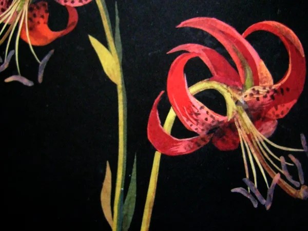
A number of rooms guide you to the Lanyon gallery.  Matthew Smith’s Lilies in a Jar, 1913, caught my eye for three reasons.

Lilies in a Jar

http://www.bbc.co.uk/arts/yourpaintings/paintings/lilies-in-a-jar-207474

I am interested in flower paintings by notable artists as they affirm it is OK to paint everyday subjects; I wasn’t familiar with his work; and, following on from our making day, where Caroline had been testing decorative backgrounds against her eggs, I was struck by the decorative background in Smith’s work, which I would normally have considered to be competing with the subject.  The Courtauld quote him as saying that he wanted ‘to create something as living as nature, so that it itself may continue to live.’  Some research and reflection required.

More flowers from a master, an early Picasso Yellow Irises, 1901.

In the same room a young girl with melancholy eyes caught my attention.

Chaim Soutine, Young Woman in a White Blouse, 1923 http://www.carollyne.com/wp-content/uploads/2013/09/IMG_2901.jpg

Such emotion from this Russian artist, a prolific painter of portraits and carcasses, amongst other subjects.

More emotion, this time from the manner in which the paint is applied.  Leon Kossoff painted Christ Church, Spitalfields on many occasions, this version was 1992.  The energy, the urgency and the angst is palpable.https://40.media.tumblr.com/18cf718056c313d7893299b59e30f2fb/tumblr_nnibhivvbt1suuc8do1_500.jpg

The same energy and use of impasto is also evident in an earlier work, Head of Speedo 1964.

Head of Seedo Dimensions: 21.25 X 21.25 in (53.98 X 53.98 cm) Medium: oil on board Creation Date: 1964 Seedo was the close friend of Kossoff and was one of his regular sitters.:

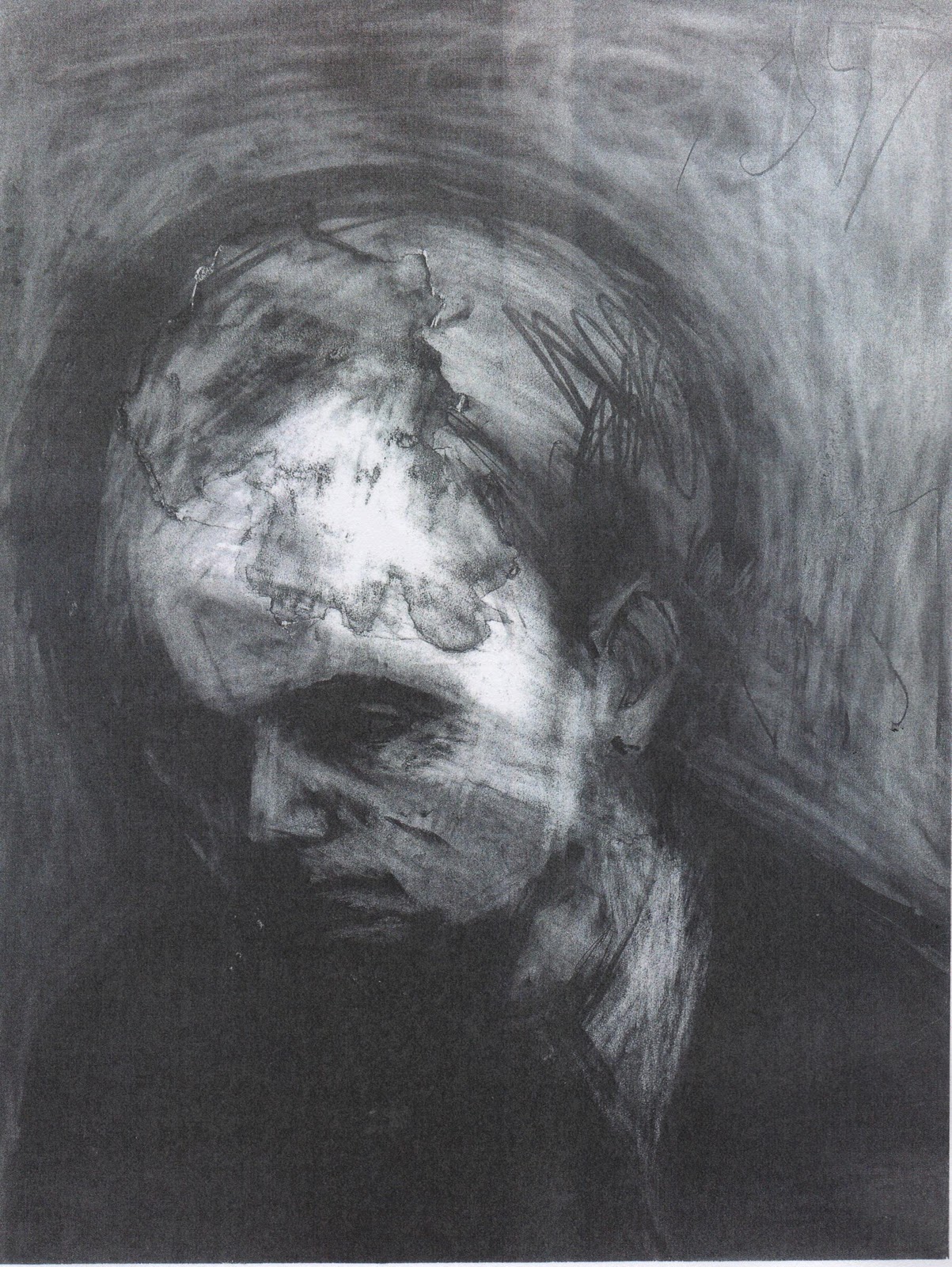
Frank Auerbach, Head of Leon Kossoff, 1957 https://lh6.googleusercontent.com/-pWIYAm61Roo/TXOZNpFsj5I/AAAAAAAAAQQ/wtO5KmDC0c8/s1600/Image+%252824%2529.jpg

Auerbach’s immense energy is woven into this charcoal drawing, where trace evidence of passionate reworking, leaves you in no doubt of his determination to capture the very essence of Kossoff.

Kossoff and Auerbach were students of David Bomberg’s evening classes at the Borough Polytechnic.  Bomberg’s passion and belief in the fundamental importance of form is evident in his students’ work.

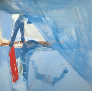
Finally I make it to Soaring Flight, an exhibition of Peter Lanyon’s gliding paintings.  Initially I am reminded of the landscapes of Richard Diebenkorn, the use of colour, the perspective, but these works offer more.  Painted from the perspective of the pilot, they are a journey through his emotional responses to the challenge, the thrill, the turbulence, that was finally to tragically take his life in 1964, at the age of 46.

Thermal,1960: ‘the elation of uplift against the possible sudden downfall are all there’.

Thermal, 1960  http://www.theguardian.com/artanddesign/2015/oct/25/peter-lanyon-soaring-flights-review-courtauld-rhapsodies-in-blue

Cornish born, a member of the Penwith Society of painters in St Ives, which included Patrick Heron, Terry Frost and Roger Hilton, he flew off his native West Cornwall coast,  naming the works after gliding terms.

Soaring Flight, 1960 by Peter Lanyon.

Soaring Flight, 1960 photograph: Courtesy of Arts Council Collection

Lanyon took up gliding in 1959.  Already a successful painter, gliding took his work to another level.

These works are Lanyon’s emotional response to the sensation of letting go, to confronting his demons, to just being free.  The Courtauld references ”a sense of breathlessness and attitude of wonder’, akin to seeing a woman naked.’

They are a unique and remarkable body of work, that succinctly convey the viewer into Lanyon’s  almost spiritual world.

Glide Path, 1964  http://www.telegraph.co.uk/art/what-to-see/peter-lanyons-gliding-paintings-courtauld-review/

Solo Flight, 1960

Solo Flight, June 1960   Credit: Scottish National Gallery of Art Edinburgh

Tate Modern – Making Traces

That word again, how could I not go.


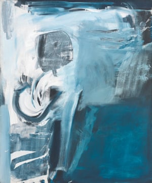
I have been looking at the work of Lee Krasner and I think this is the first work I have seen in the flesh. Gothic Landscape, 1961 was painted five years after the sudden death of her husband, Jackson Pollock, it is one of a series of gestural paintings, whose emphatic brushstrokes reflected her grief.

Gothic Landscape 1961 Lee Krasner 1908-1984 Purchased 1981 http://www.tate.org.uk/art/work/T03291

Gothic Landscape 1961 Lee Krasner 1908-1984 Purchased 1981 http://www.tate.org.uk/art/work/T03291

The next room was dedicated to Rebecca Horn, a deeply committed artist, whose work I don’t yet understand. (Some background to her work  http://www.theguardian.com/artanddesign/2005/may/23/art)

006The House of Pain 2005

Gestural fingertip mark making with crayon marks from her pencil mask.

007

American artist Amy Silman is another artist I have yet to research. Her canvas Clubfoot 2011, clearly shows the history and subtlety of her mark making, which draws you into her work.

010

American Mark Bradford’s Riding the Cut Vein 2013 is a huge work, collaged from scraps of posters found in the area depicted, a contemporary take on the work of de la Villegle, which is shown alongside.

014 a closeup of the right hand section.  His paintless process builds layer upon layer of process and material history.

Details from his recent exhibition at the White Cube.  http://whitecube.com/exhibitions/mark_bradford_through_darkest_america_by_truck_and_tank_bermondsey_2013/

German artist Gerhard Richter, whose work I really like for its tactile sensitivity on a grand scale, had a single room with four of his large scale paint and scrape works, showing the history of marks, movement and gestures.

017

Unlike to sensation I experienced in the room dedicated to Lanyon’s aerial views, where I felt I was silently gliding with the artist, in Richter’s room, the collective works felt like smothering, rather than uplifting.

The final work that caught my eye in this huge exhibition of nine rooms was a small abstract photograph by American Brett Weston.

020

He works from nature to capture that that we miss.  I thought this image was Chinese calligraphy, but is in fact tree bark.

A behinds the scenes view of the exhibition http://www.tate.org.uk/context-comment/video/making-traces-tateshots

This exhibition was brilliant in its conception and presentation of the various meanings of this word.  There is so much more to be seen than I have mentioned.  So much to reflect on and ideas to be taken into my work.

On the way back to the station I popped into the Bankside, which stands in the shadow of Tate Modern,  and chanced upon this arresting woodcut  Golden Girl 120 x 120cms, by Laura Rosser.

http://printmakerscouncil.com/artist-page/?artist=laura-rosser

PC-golden-girl-1114x1170

It reminded me of a photo I took in Cornwall a few years ago and how I might transform the image.


Fat Bottomed Lady in Looe

I am not sure I achieved my objective of improving my critiquing skills, but I now have first hand experience of the power of emotion in painting, and the sensitivity that traces can bring to work.  An amazing day.